Summary
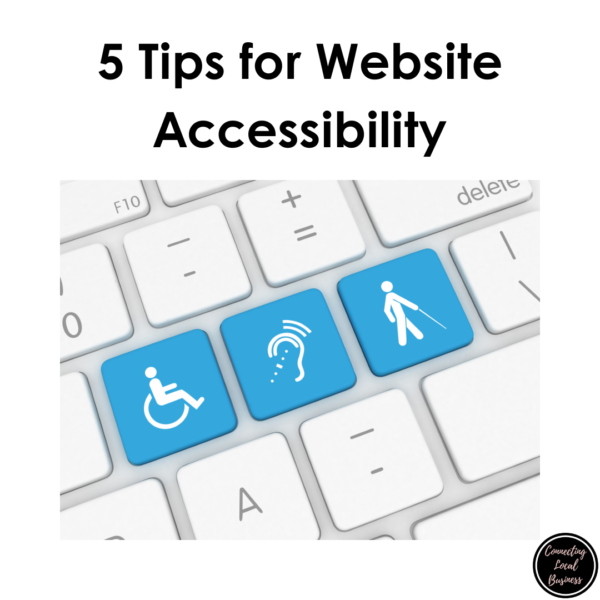
Accessibility is not new when it comes to website development. Some guidelines have been available for many years and are continuing to be upgraded and updated. The ADA recommends using these guidelines and there are specific ones for government sites.
But what does that mean for a small business owner who may manage their website? We need to be cognizant of how we are updating our site so that anyone who comes to our business will be able to use it. Whether it be reading an article or completing an order, each step should be accessible to that person.
Below are five tips you can use to make sure what you are putting out is assessable. You can also use these tips to go back into your site and make some changes.
If you have a website, whether it be business-related or a personal blog, you need to be aware of some changes that may be occurring in the next year or so.
On the horizon are potential new laws, especially in California, that will require everyone to have the ability to access your website. What does that mean, you may ask?
That means we need to start thinking about accessibility.

Accessibility is not a new concept in terms of websites. People use the Internet daily, which requires the use of tools needed for Accessibility.
They may use a screen reader to read the text to them. This may mean they watch videos but need the captioning to tell them what the video says.
If you think about it, millions of people may be using specific tools to access websites, and we must think about that when we are building and publishing our site so it is as user-friendly as possible.
Accessibility is not new when it comes to website development. Some guidelines have been available for many years and are continuing to be upgraded and updated.
The ADA recommends using these guidelines, and there are specific ones for government sites.
But what does that mean for a small business owner who may manage their website?
We need to be cognizant of how we are updating our site so that anyone who comes to our business will be able to use it. Whether it be reading an article or completing an order, each step should be accessible to that person.
Below are five tips you can use to make sure what you are putting out is accessible. You can also use these tips to go back into your site and make some changes.
It’s better to start now than to be forced to do the updates or risk getting fined or something similar.
I have also developed a checklist that you can use to work on as you make changes to your website. This is not everything you may need for your specific website and is not represented as such, but it is a good start.

5 Tips for Website Accessibility
Headings
Style Headings: Heading styles are consistently used to aid the navigation of the page and post. Heading styles are used so that Heading levels (H1, H2, H3, etc.)(sometimes called Styles depending on the website builder) are used and nested correctly – largest to smallest.
H1 is the Title of the Page or Post and is automatically applied. H2 should start your first heading as you build your pages/posts. You can use as many H2’s as you want, but these should be in numeric order and not skip sizes.
Fonts and Formats
- Fonts & Formats: Fonts, colors, and formats (bold, italics, etc.) are not used as emphasis instead of a heading style.
- Fonts: Use easy-to-read fonts such as Ariel, Helvetica, Century Gothic, Veranda, or Tahoma to name a few, and keep the number of fonts on a page to no more than three to make the content easier to read and navigate. Sizing should be 16 at the paragraph level; 18 for a minimum heading size
Links
- Links: Links are embedded within meaningful and unique text (called hyperlinks) instead of displaying the URL only. Always avoid phrases like “click here” “read more” and “here’s the link”. Screen readers will let the user know it is a link.
- Hyperlinks: Links do not open on a new page. Those who use screen readers or low-vision visitors may not see the additional page pop in.
Lists
- Lists: Lists are created using the bullet or numbered list tool and not formatted manually.
Alt Text
- Alt Text: Alt text is used on all images, graphics, Word documents, slide decks, etc. Alt text is a short, concise description of the image or object that you are including. This is what a screen reader reads to the user when it comes to that portion of a website.
- The alternative text does not contain “image of,” “picture of,” or file extension (e.g., “.jpg”).
- Tip– Always name your image first before uploading it.
- Resize image: Resize the image before uploading to no bigger than 1000 pixels. 800-900 is usually sufficient.
Video and Audio Transcripts with Closed Captioning
- Videos: Videos have accurate captioning and do not rely on auto-generated captioning. They also include player controls to play and pause.
- Audio: Audio files include appropriate transcripts.
- Written Transcript of Video and Audio: This is included either on the page itself or as a separate optional download linked before or after the video/ audio.
- Players: Video/audio media players are not set to auto-play
One thing to note if you have a WordPress website:
When you are making changes to images or objects you have included other than text, you may need to re-insert that image or object back into your page or post.
Just adding the Alt Text on the Block Editor in this instance would only add it on the actual page/post, but not in the media library. If you have built it in Classic Editor, you will need to reinsert the image once changes are made in the library.
There are plug-ins available for WordPress applications that can help your site become more accessible. You can also find some for Squarespace websites. Research apps or plug-ins available for your specific site builder.
I hope this helps you get started with making changes to your website. Set some time aside to start working on changes from today and move backward in time.
For more detailed assistance with your specific business website, consult a website developer with experience in ADA compliance for websites.
Don’t forget your free Checklist!
If you need assistance, reach out, and I can assist with clarification or application options.


0 Comments